
ˇˇ
ˇˇ
ˇˇ
ˇˇ
ˇˇ
ˇˇ
Design panel is to be the main look of the final output of HelloDevice IDE (applet or application).
The design panel is resizable and consists of several sub-pages that will be displayed by one page at once. You can add or remove its sub-pages. The design panel consists of two sub-pages initially. The design panel must have at least one sub-page. To move between its sub-pages, use page move button or combo box in the tool bar at the design-time or use PageJumpButton component at the run time.
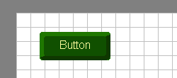
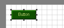
The design panel provides an intelligent way of component layout management such as grid and snap function. When the grid is enabled, there appears a set of vertical and horizontal guidelines on the design panel. When the snap is enabled, selected components will be stuck to the nearest reference grid line when you drag the components. The grid width and height is resizable from the grid property menu.
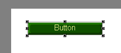
A selected component can be dropped into the design panel. A component will have a selection border when it is selected. You can move and resize it by dragging the selection border with mouse. Also you can adjust the location of selected components by pressing arrow keys. The property editor of the selected component will pop up by double-clicking on it. All graphical components have at least one property and its value can be changed from the property editor.
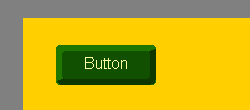
Just like any other components, every sub-page of the design panel has its own "property" that you can customize. You can change the background color of the design panel or put an image file on it.
 |
 |
| Put
a component on the design panel
ˇˇ |
Resize
component size
ˇˇ |
 |
 |
| Show
grids on the design panel
ˇˇ |
Snap
to grid lines
ˇˇ |
 |
 |
| Change
background color of the design panel
ˇˇ |
Put
an image on the design panel such as watermarks
ˇˇ |